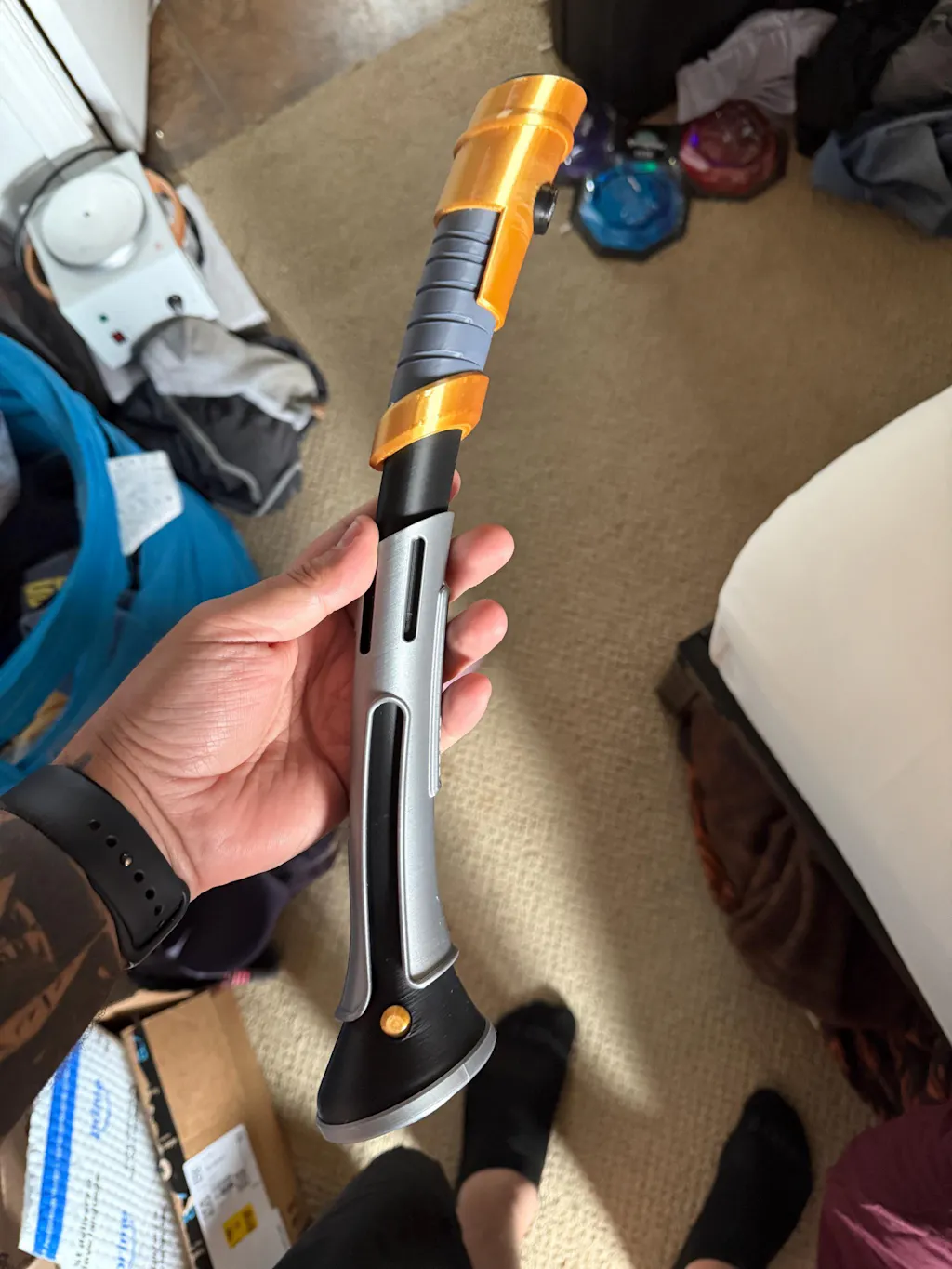
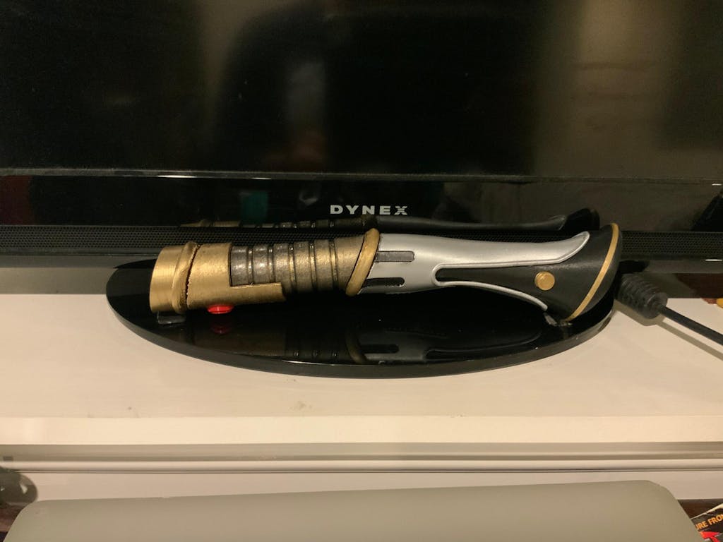
Kirak Infil'a's Lightsaber | No Paint Required | 3D Printed | Dark Forces | Clone Wars | Lightsaber Display Mount on Desk or Wall
Assembled Saber / 0-No Display
$55.00
Sale price
$55.00
Regular price
Skip to product information


Kirak Infil'a's Lightsaber | No Paint Required | 3D Printed | Dark Forces | Clone Wars | Lightsaber Display Mount on Desk or Wall
$55.00
Sale price
$55.00
Regular price
A green-bladed curved-hilt lightsaber was owned by Jedi Master Kirak Infil'a during the early stages of the Great Jedi Purge. After killing Infil'a, Darth Vader traveled to the planet Mustafar to bleed the kyber crystal inside Infil'a's lightsaber. Vader used the saber when he hunted Jedi Master and Chief Librarian of the Jedi Archives, Jocasta Nu. The hilt was subsequently destroyed during an attempt on Vader's life, during which the hilt was shattered by the combined strain of a tractor rifle and Vader's pulling it back with the Force. Salvaging the crystal, Vader would soon afterwards craft a new hilt for it. -Wookiepedia
This saber will come in colored pieces. It does NOT need to be painted. Choose if you want it assembled or not. It is 3D printed, so it won't look perfect.
This item is intended to be used as a display item. Using it for cosplay, role play or just swinging it around could break the item. I'm not responsible for the item breaking if you aren't just going to hold it gently and place it on a shelf.
This is a 3D printed product, so there may be minor defects (rough edges, bumps, etc). It is all made of Biodegradeable Plastic. I have spent a lot of time calibrating my printers and I use the best printer and settings for the desired effect on each model. I use only the highest quality filament to ensure good quality and durability.
I have printed everything in my shop and tested before posting to my store so that I can ensure that I maintain the quality that I expect. If the quality is not to my liking I will not ship it.
I reserve the right to make minor updates to this item's design. So long as it does not radically change the intention of the product's use, your received item may look slightly different than in pictures. Color also may appear slightly different in pictures than the received item.
Please note, this is not affiliated with Star Wars in any way.
Designed and sold with permission from 3Demon
https://3d-mon.com/3d-model/groupe/male3dprintmodel/kirak-infilass-lightsaber/